Level 6 History of art symposium

Duality: Confronting Contemporary Perceptions

Visiting the Level 6 symposium was informative and gave me a chance to listen to level 6 art history students discuss their contemporary viewpoints on a range of interesting topics, many which are relevant when discussing contemporary art. 

Hypocrisy and hope

One student, Francesca discussed three different marketing campaigns, lynx, Dove and fair and lovely, all of which have an underlying message revolving around beauty standards across the world. The use of comparison between campaigns in Britain and India, allowing her the chance to compare beauty standards promoted by advertisements for a range of different types of women. The presentation as a result had more of an edge as it provokes discussion on the different target audiences for these campaigns but the overall narrative of oppression and the preying of marketing companies on insecure women.

I like how Francesca discusses how an organisation like Dove which is meant to promote ‘real beauty’ and empower women is still in some ways in its ads showing a small range of the women in the world. I don’t think she fully showed how stark the contrast is between the Dove beauty campaign and the Lynx campaign, discussing how both are oppressive and objectifying. However, in these cases the Lynx advert is much more extreme in terms of these two things. The sexual objectification of women is something that appears throughout many marketing campaigns especially those for perfumes or beauty products because companies want to profit by promising fulfilment and beauty. I found it interesting learning about the difference between our beauty standards in the Uk versus in India and how in India there is a quest to maintain white beauty. This ideal has been engrained within Indian society and these ads exploit this.

It is vital to continue to penalise marketing campaigns for promoting unhealthy standards of beauty and instead promote self-love and equality, moving away from the racist and sexist undertones that have been a huge part of advertisements.

Humanity and hyperrealism

Under the sub-category of ‘humanity and hyperrealism’ Clare Todd discussed Art using poetry in museum and galleries. Her passion for poetry came out during her lecture and I like that she had looked at both the way artists are inspired by poetry and why it should be implemented into galleries.

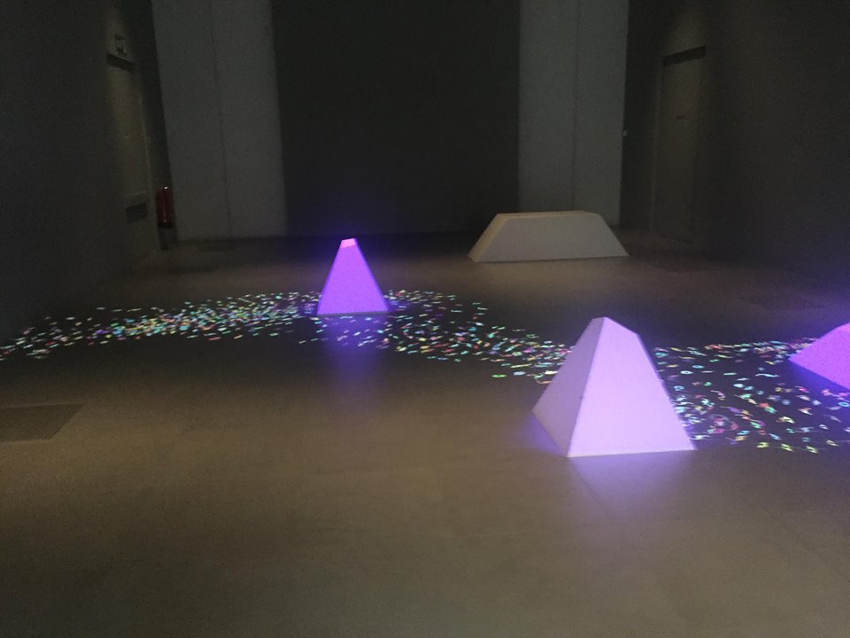
I like the idea of enhancing a visit to a museum or gallery by creating different ways to interact with the art, this is especially important when promoting the arts to younger children in order to possibly make the works more comprehensible for a range of people. Clare Todd suggests poetry as a way of increasing learning and comprehension. Bringing a variety of media into play in order to convey a more succinct message behind works of art, as well as allowing a ‘more inclusive emotional experience’. Clare used David Hockney as an example for the importance of poetry in art showing his works and how he was inspired by poetry.

Personally, I love poetry and it is a brilliant way to express inner thoughts and imagination, despite this, I don’t feel it is necessary to display art and poetry in a way that places an interpretation on a work of art. Art is powerful, and a great piece can speak for itself. I see the importance of poetry for inspiration for creative thinkers but don’t see the necessity to use poetry to enhance artworks that already stand out on their own. This does not mean I do not support the creation of works that combine both artistic practice and creative writing.

Location and Interaction

I was particularly intrigued by Isabelle Melnik’s lecture on Street art and social media, as it is something that is relevant today, the link between social media and art is important as due to social media artists can spread their works around the world digitally. Street artists especially can have their work permanently online even if the original work is changed or destroyed. Isabelle discussed the debate between whether graffiti is vandalism or art, a topic which interests me as I feel street art really makes up a cities’ personality. She was able to link this back to Liverpool, discussing the rising tourist attraction that is the Baltic Triangle and the relevance of its street art that appears on its walls. She also presents the use of street art by companies such as Adidas and Gucci which in turn shows the importance of street art in today’s culture and its true artistic value.

I fully agree with Isabelle that graffiti is extremely beneficial to art, despite it sometimes having a bad reputation with its association to anti-social behaviour. In my opinion street art has developed into a beautiful form of art that is now less so associated with criminality and more so with creativity and individuality with unique art pieces characterising cities around the world. The thing that makes graffiti even more interesting is that it tends to not be displayed in galleries, with the exception of Banksy, generally making it more temporary and difficult to preserve. Street art like ‘for all Liverpool’s liver birds’, Paul Curtis, promotes interactivity with artworks through social media and encourages the growth of support for street artists instead of the negative connotations that come with painting on the world’s streets.

Visit to Sheffield millennium gallery- Leonardo Da Vinci

The Sheffield Millennium gallery is one of 12 galleries chosen to house 12 of Leonardo’s famous drawings. These drawings are a main part of what is left of Leonardo’s heritage, representing to viewers the talent of Leonardo and displaying his greatest achievements as not only an artist but many other things. The Sheffield Millennium gallery takes advantage of this exhibit to create interactive activities in order to educate visitors more about Da Vinci’s drawings and the deep importance of these on reflecting his life. Interactive activities include talks on Da Vinci as well as a chance to create anatomical drawings somewhat like Da Vinci’s.

I like that the gallery has paired this exhibition with a contemporary art piece that has been greatly inspired by Da Vinci’s drawings, specifically his drawings on the movement and flow of water. This piece is called ‘the Vehicle of Nature’ by Universal Everything, I enjoy how the piece uses geometric shapes to break up the gallery space and create an obstruction for the ‘water’ that flows around it. The design collective ‘universal everything’ have put a new twist on Da Vinci’s water drawings by projecting not only the flow and movement of water but also the flow of blood cells and the flurry and movement of people. They have taken inspiration from Sheffield and the peak district, natural forms of rivers and boulders remade through the geometric shapes and projections. The installation is entrancing with its beautifully made projection that flows from one side of the room to the other. The creators have paired the projection and shapes with a sound piece that adds to the atmosphere of the room and re-establishes the concept of the everyday movement of nature.

‘the vehicle of nature’ by Universal everything (my own photograph)

Some would say the most important work on display in Sheffield is the Head of St Philip, a study for what not only considered Da Vinci’s most famous work but is one of the most famous paintings in the world, the Last Supper. Although personally, I find some of the other pieces more interesting, for example his anatomical studies that show the muscles and veins of the inner workings of the body, Da Vinci uses intricate detail in these works which are beautifully done.

In comparison with the Liverpool exhibition I prefer how the Millennium gallery has displayed the works. The installation alongside the exhibition is engaging in the way it shows the use of modern technologies whilst also reflecting similar concepts to Da Vinci’s drawings. I also like how the Sheffield gallery has included a space for visitors to sit down and draw, retracting back to the beauty that is taking a pencil to paper and creating a piece of art.

Fine art exhibition

I was very intrigued on finding out the fine art students from John Moores University were exhibiting their work temporarily in both the Walker Art gallery and St. Georges Hall. Firstly, I was excited to see some of my close friends, exhibit works they were so proud of in such important places to Liverpool’s history. Secondly, I wanted to observe how these contemporary art works from the students fitted alongside these other works that had been in the Walker art gallery for many years and how the students interacted with these different spaces.

The space that I enjoyed observing the most was St Georges hall, the exhibition covered some of the tunnels, underground rooms and general wall space, I enjoyed how the work presented gave a completely new way of looking at the tunnels. Some artists played with the dark past of the building by creating works that were inspired by criminals, others chose to bring light to the tunnels filling the space with pieces that completely changed the atmosphere of the building. For example, one artist hung paper birds and flowers in a room that was originally dimly lit and intimidating to enter, their work changed the space, so it radiated a warmer feeling. Another turned a room into a comfy space which created an interesting contrast with the rest of the art on display. They projected a projection of a sheep jumping over a fence which created this sort of dream-like feel that was immediately comforting to those who entered the space.

The walker art gallery exhibit was very different as it placed these artworks in a place that already contained artworks. Some artists played with this by finding inspiration from works that were already on display, one artist created 3 podiums and designed 3 postcards that corresponded to artworks in the walker gallery. This gave a modern twist on art works that had been on display for a long time. Another artist created a human-sized cardboard box which from outside appeared completely normal however inside it appeared as a space ship, this was an interesting juxtaposition to the pre-Raphaelite artworks on display in the room.

Hepworth Gallery- Wakefield

My visit to the Hepworth gallery gave me the chance to explore sculpture and ceramics further and in contrast to the visit to Yorkshire sculpture park I was able to witness sculpture in a gallery space. Like the Sculpture park the Hepworth gallery contained works from Henry Moore. I liked that I was able to explore Moore’s thought processes behind his works by exploring a different side to his life as an artist. His work ‘Reclining Figure’ shows his continuation with the human form shown in the Yorkshire sculpture park on a larger scale. Moore has a direct connection to Yorkshire, being born in Wakefield. Therefore, I like that his works are on display in both these locations.

Like Moore, Barbara Hepworth was from Wakefield. The gallery follows her life through her impressive sculptures that explore shape, texture and colour. Throughout the gallery, it is evident Hepworth used different materials for her sculptures as well as different shapes and colours this creates a gallery space that is visually- appealing for visitors. It is clear Hepworth had an eye for form and shape and is able to make works that reflect this. A piece of hers that stood out to me was ‘Constuction (crucifixion)’ a large sculpture that stands individually against the other works in the room. I was surprised to see this piece after viewing some of Hepworth’s other works that had less harsh contrasts and dimensions. Her use of aluminium with some minimal colour makes the piece stand out against the background of the gallery space. Another sculpture of hers that interested me was ‘spring’ I enjoy how the piece juxtaposes between the softness of the curves and the harsher stark lines created by the strings that stretch from one side to the other. Hepworth’s overall use of strings creates an interesting effect that plays well against her other works. Her interest in the cosmic universe is evidenced through her paintings and sculptures in the gallery, one, ‘Genesis III’ caught my eye, the abstract forms represent the creation of the world, shown through the title of the piece. Hepworth’s interest in the universe in general allowed for the creation of beautiful abstract pieces like this one.

Close up of Barbara Hepworth’s sculpture ‘Crucifixion’ (my own photograph) – ‘winged figure’ is present in the background

The Hepworth gallery is also home to a range of contemporary works that make up a part of the collection. ‘Leg chair (sushi nori)’ by Anthea Hamilton is a unique piece in the gallery, I like that it is weird and makes you question why are there rice cakes in between those legs? This contrast between furniture, body forms and food create an unusual, provocative piece that shows a different side to sculpture.

Anthea Hamilton’s ‘leg chair (sushi nori)’ (my own photograph)

Yorkshire Sculpture park

The mistake I made whilst visiting Yorkshire Sculpture park was not wearing wellies, causing many issues with my ability to balance whilst viewing many of the works….

With the background of the beautiful Yorkshire countryside, these sculptures live in harmony with the natural surroundings. This adds a new dynamic to the works in comparison to pieces that are placed against the white cube background of modern-day gallery spaces, changing the way people view them. An example of this are Giuseppe Penone’s works. Penone’s works relate to the natural world itself and by placing his works in Yorkshire sculpture park this connection can be increased. The choice to place these sculptures amongst nature results in the sculpture being consumed by its natural surroundings as well as provoking new meanings and conveying the sculptures beauty in an even more in-depth manner. I like how the sculpture park presents his work in both the setting of a gallery space as well as an outside space, allowing different responses from the viewer of his artwork. His work ‘Matrice’ spans 30 metres long across the gallery space and therefore is difficult to miss, this piece is a masterpiece with its intricate attention to detail, it shows the real beauty of Penone’s work and abilities as a sculptor.

Many of the works I came across in the park were unexpected, every corner I turned I witnessed a new type of sculpture completely different than the one I had seen moments before. Yet all these sculptures seemed to live harmoniously. A piece that kind of contrasts to the work of Giuseppe Penone is ‘Trees’ by Dennis Oppenheim, he like Penone had been inspired by nature yet took his work in a different direction. I like how by placing Oppenheim’s ‘trees’ in the park creates a stark contrast between the natural and artificial world but also intertwines them. This pieces spans across a corner of the park and is visible some distance away, enticing the visitor in with the movement and spirals of the sculpture. But up close it is clear to see all the parts of the piece, which includes baths, toilet seats and dog kennels. Almost like a floating junkyard. Against the bright blue sky of the day, the sculpture appeared quite beautiful and I enjoyed exploring it from different angles.

I think the beautiful thing about the park is that no matter where you are you can see the diversity of the sculpture. As well as this your location in the park can affect your perception of different works, as some you may see from the other side of the lake before you get a chance to see them up close and as you get closer your opinion on the piece sometimes changes. Jaume Plensa’s ‘Wilsis’ plays interestingly with perspective and uses the vastness of the park to its advantage. From a distance this piece seems rather ordinary in a sense, well except for the scale, however as you move closer its clear to see the extraordinary nature of the piece. The face is revealed to be flattened as you move around the lake. Plensa uses this sculpture to present a journey of discovery, exploring the idea that being human is complex. 

‘Wilsis’- Jaume Plensa (my own photograph)

Overall, it was interesting to visit a place like Yorkshire sculpture park that evokes a different response than viewing artworks in a gallery space. The range of sculptures in the park that explore the use of different materials and ideas creates a dynamic experience. The background of the Yorkshire countryside develops a calming atmosphere that allows visitors to feel connected to the works and discover a new side to sculpture in general.

Gina Tsang- Output gallery

Gina Tsang’s two-channel video installation ‘fine heart’ explores her heritage through her recent visit to China and Hong Kong. She combines this video footage with old family photographs in order to create an exhibition that exudes a deep, meaningful approach to video making. Through her visits, funded by a travel grant she received from the Susan Cotton Family. She was able to use these visits to dig deeper into her family roots and connect further with the Chinese culture she had grew up around. I like how she discusses that although she had been raised around these Chinese traditions that on visiting China it was different than what she thought it would be describing it as ‘calming’ not being able to understand anything.

The output gallery, the exhibition space that held Gina Tsang’s work, works mainly with artists who are from or based in Merseyside. This is unlike other galleries in and around the Liverpool area that don’t fund works from lesser known artists from the Merseyside area, which is important for the Liverpool art scene. It’s not only the larger artists and galleries that make up the scene but the more intimate events and exhibitions that give way to new, local artists. Many who create engaging works that reflect their personal experiences and interesting ways of looking at art, whether this is through temporary installations, performance pieces or in Gina Tsang’s case, video work.

I liked how the room in the gallery was set up, in a way that was quite intimate and made it easier for the viewer to connect more deeply to the footage on show, with less crowding like other galleries that sometimes make it difficult to fully enjoy the work on display. I liked how through this video I was able to get an insight into Gina Tsang’s perspective on the world and the imagery that she found related to her goal for this video installation. I especially liked the footage from Hong Kong, from the ferry, as well as the way she overlaid the footage with childhood and family photographs.

My own photograph of a part of Gina Tsang’s video installation

Jon Edgley ‘smile and wave’- CBS gallery

Before Jon Edgley’s solo exhibition ‘smile and wave’ I had never seen any of his work before, this exhibition was my first impression of him both an artist and a person. My immediate instinct was that although his work had an underlying sense of sadness, he was able to also portray a more playful tone through his drawings aided by the interesting cardboard floor he had put down in the gallery. I like how here he has made art with some more basic materials, e.g. carboard, pen etc. But is still able to convey his deeper message, showing that sometimes the talent of an artist can be shown in a simpler manner.

Although the works on display were of the same medium, each one is individual and unique with its own story and personality. I liked especially that he had made a large cardboard booklet to come alongside the exhibition as well as a small sketchbook that conveyed what he called his ‘private thoughts for public viewing’. His depictions of human form range from more detailed drawings to simple shapes and facial expressions. I like how he so distinctly expresses the deep emotional parts of his feelings through his works, discussing mental health through his drawings of different characters with interesting facial expressions and different body language. The simplicity of the pieces works well whilst some writing on certain pieces creates a different dimension to his work, I’m glad he has not decided to use words on all the pieces. Although there is a feeling of gloom over many of the works, the way he chooses to depict these feelings in a more humorous, playful way meant that although the work brings light to the negative feelings many may feel it also was a joy to view.

Jon Edgley’s sketchbook (my own photography)

Light Blue exhibition- the royal standard

Finding connections between the emotions one expresses and our senses is a concept that I find incredibly interesting. ‘Light Blue’ aims to explore this effect of our senses on how we feel. Everyone can relate to associating specific sounds or smells with different times in their lives and these are usually linked to a negative or a positive feeling or memory. Colours have always been associated with different feelings, artists use colour theory in order to express certain feelings and thoughts. I like how these 4 artists have called their exhibition ‘light blue’ in order to show an example of this colour theory and sensory idea.

The way in which the exhibition allows the viewer to interact with the artworks is interesting, allowing visitors to explore their senses in a more in-depth manner and consider the importance of your sounds, smells and colours on your emotions. I appreciate the concept and ideas behind the exhibition as well as how interaction has been used. I like the way the artists have tried to create a calming atmosphere by painting the walls light blue with clouds.

In general, the comprehensibility of the exhibition could’ve been improved, with a lack of flow between the different pieces, sometimes it was difficult to understand the link between the underlying concept and the actual works. This could be due to a lack of fluidity between the artists visions or not enough time to carry out their desired vision. I imagine it’s difficult to create an exhibition between 4 different people with possibly various thoughts and ideas on the best way to carry out different parts.

The knitted scented masks were very visually appealing and fun to interact with, there was great care taken to create the 3 masks. I enjoyed how the outside of the mask seemed to have this sort of brain like appearance knitting in with the sensory concept of how the brain is the controller of all our senses. I also liked the sound piece on the iPod that played well with what the artists were trying to convey.

One of the three knitted scented masks (my own photograph)

Fernand Léger- Exhibition review- Tate Liverpool

Fernand Léger- Exhibition review

Fernand Léger was not afraid of embracing the extraordinary, evidenced in his bizarre, intriguing works which reflected at the time his progressive view of life in the 20th century. Tate Liverpool’s exhibit covers both his early and late works highlighting Léger’s diverse range of experimental pieces as well as his change in mentality over the years, his political views and modern perception of everyday life.

On entering the exhibition, you come face to face with Léger’s individualistic, geometric style of painting paired perfectly with his avant-garde black and white film ‘Ballet Mécanique’ which immerses you in sound and dynamic imagery. This is one of the two films that are shown at this exhibition, the second being ‘the girl with the fabricated heart director’, a part of the Dadaist film ‘Dreams that money can buy’. Just these films alone make this exhibition worth seeing.

The exhibition begins with his pre-war paintings including ‘the card players’ (1917), his mechanical approach is shown here with a focus towards an appreciation of the human figure which continues throughout his career. Léger was able to reflect on other artists at the time, using a cubist style with his own twist. Tate Liverpool has done well to show the progress and development of Léger’s works over the years by displaying his works in a chronological order with the Information boards highlighting Léger’s key beliefs and reasoning behind his works.

His piece, ‘Essential happiness, new pleasures’ takes up a whole wall of the exhibition, constructed together on the walls of the Tate. This relatively forward-thinking piece brings the viewer away from Léger’s iconic painting technique and towards a new approach with the use of modern photography techniques and collage. I enjoy how the piece is modern with its strong, blunt blocks of colours contrasted with Léger’s black and white photography of agricultural everyday-life. Also, I like how the piece reflects on the political culture at the time making a statement on the modernisation of agriculture.

An iconic piece by Léger ‘Dancers with keys’ is also displayed, the contrast between the abstract fluid forms of two dancers is contrasted with the harsh, blunt geometric shapes that are blocked with colour showing both Léger’s obsession with the human form and with new technology and mechanics. This is again contrasted to the dark loose shadowy shapes that make up parts of the background. This piece like many in this exhibition prove that Léger was well ahead of his time creating works that could be compared to the pop art pieces of the late 50s but created in the 30s.

The Léger exhibition takes over three quarters of the third floor of the Tate, the rest is dedicated to a pair of South Korean contemporary artists (lesser-known than Léger), Moon Kyungwon and Jean Joonho, who present their project ‘news from nowhere’, an insight into their ideas of a utopian future and a reflection on today, like what Léger was trying to portray. Both exhibitions are relevant in society today and create connections with the world around them.

Leonardo Da Vinci- a life in drawing

‘There was (not) another man born in this world who knew as much as Leonardo, and not only of sculpture, painting and architecture, and that he was truly a great philosopher’ King Francis 1st of France (1517-19).

500 years after the death of the great Leonardo Da Vinci, we can gain this new insight as a public into his works and the methodical thought-process behind his iconic pieces. The drawings are Leonardo’s private papers, his in-depth process. 12 drawings each were selected for different venues across the UK, most importantly for the Walker Art Gallery in Liverpool. Every sketch tells a different story of Da Vinci’s life as not only an artist but a philosopher, a scientist among many things.

The exhibit in the Walker contains a range of Da Vinci’s drawings showing various interests, including botany and anatomy. It is amazing to see the intricacy in Leonardo’s drawings, up close, the detail and the effort put into his sketches. This detail is shown in the hairstyle of ‘The head of Leda’ drawn around 1505-8 which shows Da Vinci’s great ability to sketch. The exhibition also displays some of Leonardo’s botanical and anatomical sketches, my favourite being, ‘the muscles of the upper spine’, 1510-11, showing Da Vinci’s extreme talent to depict anatomical figures and scientific ability. Da Vinci’s artistic talent gave him the ability to show in detail the layers of muscular tissue and the complexity of the workings of the human body, in some ways looking at this piece you can see the movement and intricacy of the mechanisms of the muscles.

The exhibition shows Leonardo’s journey through life, the last drawing shown is one of sadness, close to his death through this drawing and translated notes the viewer can see a darker side to Da Vinci. His last years where he witnessed pain and destruction shown through the ‘apocalyptic scenes’ that he depicts here, highlighting the delicacy of nature and the world around him.

The exhibition was extremely accessible and as it was free you can’t really go wrong, although it was busy, as expected, it was easy to move around and view all Da Vinci’s amazing works. To see these works was both inspiring and an honour as Da Vinci’s brilliance shines through all his intricate, beautiful drawings. It is unknown when an opportunity like this will come about again, so I will be visiting the Walker multiple times to see this wonderful exhibition.